Css 3 features, uses and examples
Source : Tuttost,WebdesignerWall,Catwhocode
Even though CSS3 is not fully supported yet, many web developers are starting to use many of the new techniques introduced. CSS3 has taken a very large step forward in helping web developers get away from importing mass amounts of images/JavaScript and making it possible to do this only by using pure CSS. I am going to go over 10 CSS3 features you will love to start using!
Border Radius
The ability to have rounded corners without images and JavaScript is one of the most sought after features of CSS3. Having to make images for each corner or importing a new library just to get the nice round edge will be a thing of the past with CSS3 Border Radius. With CSS3, we can do this with only a few lines of code:
view sourceprint?
1 #my_id {
2 height: 100px;
3 width: 100px;
4 border: 1px solid #FFF;
5 /* For Mozilla: */
6 -moz-border-radius: 15px;
7 /* For WebKit: */
8 -webkit-border-radius: 15px;
9 }
Border Images
This is one of my favorite upcoming features, having border images will allow developers and designers to take there site to the next level. You can be as creative as you want and be able to apply it as a border without extra elements. Quite simple code really:
view sourceprint?
1 #my_id {
2 /* url, top image, right image, bottom image, left image */
3 border-image: url(border.png) 30 30 30 30 round round;
4 }
Box Shadow
Before CSS3, we had to either use a shadow image or JavaScript to apply a shadow or create the shadow directly in the image. Neither of those are fun to do in any way. With CSS3 Box Shadow we can apply shadows to almost every element of our website. Here is how:
view sourceprint?
1 #my_id {
2 background: #FFF;
3 border: 1px solid #000;
4 /* For Mozilla: */
5 -moz-box-shadow: 5px #999;
6 /* For WebKit: */
7 -webkit-box-shadow: 5px #999;
8 }
Multi-Column Layout
Another CSS3 feature that developers, including myself are very eager to start using is the Multi-Column Layout. It offers a new way to arrange text in more of a “news paper” type way. You have the choice to pick the amount of columns, the column width, column gap width, and column separator. A feature like this was not possible before CSS3. Here is how you do it:
view sourceprint?
01 #my_id {
02 text-size: 12px;
03 /* For Mozilla: */
04 -moz-column-gap: 1em;
05 -moz-column-rule: 1px solid #000;
06 -moz-column-count: 3;
07 /* For WebKit: */
08 -webkit-column-gap: 1em;
09 -webkitcolumn-rule: 1px solid #000;
10 -webkit-column-count: 3;
11 }
*Note: column-space-distribution is not implemented yet, this feature is to describe how to distribute leftover space.
Multiple Backgrounds
In the past, having layered backgrounds required you to create more than one element. But now, with CSS3 you can have multiple backgrounds on a single element. This will eliminate a huge annoyance that we have had to deal with in the past. Here’s how it works:
view sourceprint?
1 #my_id {
2 background:
3 url(topbg.jpg) top left no-repeat,
4 url(middlebg.jpg)center left no-repeat,
5 url(bottombg.jpg) bottom left no-repeat;
6 }
@font-face
Now, this feature is not entirely new to CSS3, it is supported in CSS2 and has been in implemented in IE since version 5, however that implementation relied on Embedded Open Type. The new CSS3 implementation will allow developers and designers to use any licensed TrueType “.tff” or OpenType “.otf” ” in their web designs. Here is how to use the custom fonts:
view sourceprint?
1 @font-face {
2 font-family: “my-font”;
3 src: url(my-font.tff) format(“truetype”);
4 }
view sourceprint?
1 #my_id {
2 font-family: “my-font”, sans-serif;
3 }
Attribute Selectors
In CSS3, three additional attribute selections are available for matching substrings of the attribute value. Here are a few examples on how to use them.
Select elements with title prefix of “t”:
view sourceprint?
1 p[title^=t] {
2 /* Attributes to give them. */
3 }
Select elements with title suffix of “t”:
view sourceprint?
1 p[title$=t] {
2 /* Attributes to give them. */
3 }
Select elements with title contain at least one instance of “t”:
view sourceprint?
1 p[title*=t] {
2 /* Attributes to give them. */
3 }
:nth-child() and :nth-of-type()
The new :nth-child() pseudo-classes is a way to select elements using a formula. The syntax for both is :nth-child(an+b), almost like a linear equation just different variables. The only difference between :nth-child() and :nth-of-type () is that nth-of-type() only considers elements of the given type.
view sourceprint?
1 /* First, Fourth, Seventh, etc..
2 /* Any type of element */
3 p:nth-child(3n+1) {
4 background: #F00;
5 }
view sourceprint?
1 /* First, Fourth, Seventh, etc..
2 /* Only li elements */
3 p li:nth-of-type(3n+1) {
4 background: #F00;
5 }
Opacity
Probably the favorite feature to come in CSS3 is opacity. It is also probably the most already used CSS3 feature as well. There have been ways to use opacity in the past with IE hacks and other methods but the new CSS3 property will allow it to me done much easier. Here’s the code:
view sourceprint?
1 #my_id {
2 background: #F00;
3 opacity: 0.5;
4 }
RGBA Colors
This new feature ties in with opacity, with CSS3 there is RGB and also RGBA. Now hopefully you know that RGB stands for “red, green, blue”. The “a” in RGBA stands for alpha (also known as opacity). This will make a lot of code shortened by tying in that extra property into an existing one.
view sourceprint?
1 #my_id {
2 background: rgba(255, 212, 45, 0.5);
Here are a list of examples and uses of css3 by Webdesignerwall and catwhocode
CSS3 As Enhancement
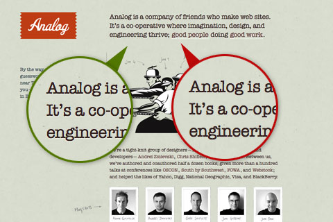
Emboss-Looking Text
Notice how Analog use a 1 pixel text shadow to make the text look embossed? The image in the green circle is captured with a
text-shadow
supported browser and the image in the red circle is captured with a unsupported browser.
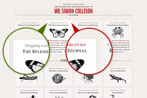
Subtle Rounded Corners and Shadow
Colly uses
border-radius
and
box-shadow
to beautify the layout boxes with rounded corners and subtle shadow. If CSS3 is not supported, it will show rectangle boxes which you can barely notice the difference.
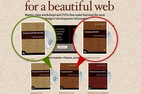
Rolling DVDs
This site uses the
webkit-transform
property to make the DVD roll out on mouseover. Users with a webkit browser such as Safari or Chrome will see the spinning animation. Users with Firefox will see the disc pop out. Users with browser that doesn’t support this feature will see the static DVD image.
Fading Transition
To see this effect: scroll down until the top search bar overlap the content, hover over the top bar, and you will see the semi-transparent background slowly fade into opaque (see it with a webkit browser).
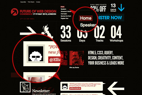
Rounded Corners
Users with a
border-radius
supported browser will see rounded corners on the Future of Web Design site.
Subtle Text Shadow
SquareSpace enhances their blog title by appling a light shadow which you can barely notice.

When Should You Use CSS3?
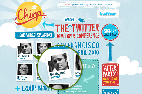
No: Rotating Images With CSS3
Be careful if you are applying border on rotated images. The border may cause jittering result.

Yes: Export Rotated Image Instead
To avoid the jittering effect, use Photoshop to rotate the image first and then apply the CSS transformation as seen on the Chirp site.
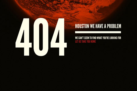
Yes: Rotating One Large Image
The rotating earth image is a very nice touch on the 404 page of FOWD (see it with a webkit browser).
No: Rotating Multiple Large Images
However, don’t go crazy with rotating multiple large images because it might look choppy.
No: Relying on CSS3
Everything looks fine if you are viewing Ryan Merrill’s site with a webkit browser. But check it again with a different browser such as Flock. Wow, what happened? Everything breaks down. The font is not displaying right and the call to action box disappeared. So, be very careful if you are relying on HTML5 and CSS3 to do your layout.

Yes: Find Fonts With Similar Width as Alternatives
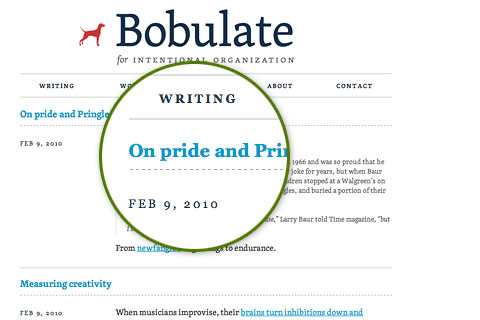
If you are using custom fonts, don’t forget to include web-safe fonts with similar width as alternatives. Bobulate is a good example. She uses Georgia as her alternative font which has similar width and x-height of the custom font Skolar.
Css3 examples by catwhocode
Pure CSS speech bubbles
In a design, bubbles can be great to illustrate a quote. In this article, talented designer Nicolas Gallagher will show you what he built with CSS3: Text bubbles, with no Javascript or images.

Source: http://nicolasgallagher.com/demo/pure-css-speech-bubbles/bubbles.html
Super Awesome Buttons with CSS3 and RGBA
CSS has always been great to enhance buttons; but using CSS3, the RGBa property, and of course a lot of creativity, you can create modern and clean buttons. The folks at Zurb will show you how in this great tutorial. Note that I enjoyed that technique so much that I used it on my own comment form!

Source: http://www.zurb.com/article/266/super-awesome-buttons-with-css3-and-rgba
Classy photo frame using CSS3
As I recently said on my other blog Cats Who Blog, images are very important in blogging, and in the Internet media in general.
In order to enhance your images and give them a unique look and feel, the box-shadow CSS3 property is a must. Here is the code used in the example below:

Source: http://www.change.org/actions/view/tell_the_senate_protect_polar_bears_from_global_warming
Easily Turn Your Images Into Polaroids with CSS3
Although this technique can be considered as experimental only (It doesn’t work on IE, as you can expect…), I have to admit that I was surprised to see that this demo only uses CSS3 and no Javascript at all.
The tutorial will show you how to use CSS3 to transform a simple image into a Polaroid.

Source: http://www.zurb.com/article/305/easily-turn-your-images-into-polaroids-wi
Fancy web form with field hints using only CSS3
Web forms are very important because this is the main way for your visitor to get in touch with you. But styling web forms isn’t easy, and in most web sites, forms are boring and quite ugly.
The following post will show you how to use CSS3 to create a stylish web form with field hints. And no, it does not require any Javascript.

Source: http://www.skyrocketlabs.com/articles/css3-web-form-hints.php
CSS3 Drop down Menu
Ah, drop down menus. Those are extremely popular and every designer or developer had to work with at least one in his career. So what about using the power of CSS3 to enhance drop downs? In this article, talented web designer Nick La will show you how to proceed. And I must say that the result is absolutely fantastic.

Source: http://www.webdesignerwall.com/tutorials/css3-dropdown-menu/
CSS 3 selectors explained
CSS3 has lots of exiting properties, such as box-shadow and border-radius. But CSS3 also introduces new selectors, which can definitely make your life easier.
Although there’s nothing hard with these new selectors, it is important to learn what new selectors are available and how they work, so you can use them in your websites. The following tutorial is simple to follow and extremely efficient; a must read for anyone who works with cascading style-sheets!

Source: http://www.456bereastreet.com/archive/200601/css_3_selectors_explained/
Recreate Mac OSX interface using CSS3
Wow! This one totally rocks. As you can see in the screenshot below, the folks from CSS3.info had fun recreating Mac OSX user interface using CSS3 and some jQuery. Unfortunately, the method they used is not detailed, but you can still view the source and learn by the example.

Source: http://www.css3.info/wp-content/uploads/2007/08/colormoduletest.html
Letterpress Text Effect Using Photoshop and CSS
Typography is definitely something that can either make a design great, or totally ruin it. CSS3 introduced some really interesting properties to enhance the texts and titles of your designs.
In this post, you’ll learn how to create a “Letterpress” effect using CSS3 and Photoshop.

Source: http://acrisdesign.com/2010/03/letterpress-text-effect-using-photoshop-and-css/
Creating a Polaroid photo viewer with CSS3 and jQuery
Seems that Polaroid’s are popular again: After the Zurb example I shown you earlier, here is another really cool way to create a gallery, using CSS3 and jQuery. The tutorial is easy to follow and the result is quite nice.

Source: http://www.marcofolio.net/webdesign/creating_a_polaroid_photo_viewer_with_css3_and_jquery.html
Suggest More by leaving a commment on this page so that users can see the real power of css 3.0