Responsive Design Video Training Tutorials – 15 Hours
Here is a collection of over 15 hours of premium video tutorials on Responsive Design by Pluralsight. In order to view the videos, you need to become a member of Pluralsight.
|
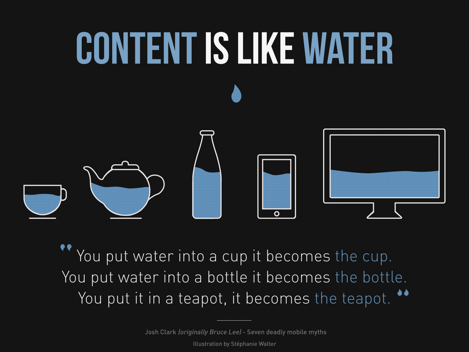
| Content is like water, a saying that illustrates the principles of RWD. |
| By Stéphanie Walter – http://www.inpixelitrust.fr/blog/illustration-content-is-like-water-et-traduction-responsive-webdesign-present-et-futur-de-ladaptation-mobile/, CC BY-SA 3.0, https://commons.wikimedia.org/w/index.php?curid=26455176 |
Background: Responsive Design Responsive web design (RWD) is an approach to web design with the goal of allowing desktop webpages to be viewed in response to the size of the device.
A site designed with Responsive Design adjusts the layout to the viewing environment by using fluid, proportion-based grids, flexible images, and CSS3 media queries, an extension of the @media rule, in the following ways:
The fluid grid concept calls for page element sizing to be in relative units like percentages, instead of absolute units like pixels or points.
Flexible images are also sized in relative units. This prevents them from displaying outside their containing element.
Media queries allow the page to use different CSS style rules based on characteristics of the device.
Responsive web design has become more important as the amount of mobile traffic now accounts for more than half of total internet traffic. On April 21, 2015, Google announced Mobilegeddon and started to boost the ratings of sites that are mobile friendly if the search was made from a mobile device.
Responsive Design
| Series | Title | Date | Presenter | Min |
|---|---|---|---|---|
| Responsive HTML Email Design | Responsive HTML Email Design | 12/18/2015 | Jason Rodriguez | 291 |
| Building Data-driven Prototypes in Axure | Building Data-driven Prototypes in Axure | 11/6/2015 | Stephanie Schuhmacher | 85 |
| Email Template Design in Sketch and HTML | Email Template Design in Sketch and HTML | 10/26/2015 | Jay Boucher | 127 |
| Creating a Responsive and Flexible Slideshow in JavaScript | Creating a Responsive and Flexible Slideshow in JavaScript | 3/30/2015 | Alfredo Lopez | 158 |
| Applying Responsive Retrofitting Techniques to a Fixed-width Site in CSS | Applying Responsive Retrofitting Techniques to a Fixed-width Site in CSS | 10/28/2014 | Rachel Wilkins Patel | 65 |
| Creating an Adaptive and Responsive Layout in Axure | Creating an Adaptive and Responsive Layout in Axure | 9/6/2014 | Antonia Anni | 72 |
| Bringing Your Website to Life with Edge Animate | Bringing Your Website to Life with Edge Animate | 7/21/2014 | Alex Hernandez | 60 |
| Your First Day in Edge Animate | Your First Day in Edge Animate | 7/15/2014 | Alex Hernandez | 66 |
| Total | 924 |